Project Overview
In this project, I was challenged to design an iOS application within a two-day timeframe that simplifies the investment process for notable stocks. I aimed to assimilate competitive insights to establish an industry-standard benchmark and leverage that understanding to craft an intuitive and seamless user experience. This work showcases my approach to creating a modern trading app that serves both seasoned traders and those new to the stock market.
______________________________________
The Challenge
The core challenge was to design three main screens that would not only facilitate the trading of stocks but also present a comprehensive snapshot of the user's investment portfolio, market trends, and transactional success or failures – all while maintaining a clean and intuitive interface.
Research & Benchmarking


I embarked on an extensive research phase where I benchmarked existing solutions, examining their strengths and pitfalls. By analyzing popular competitors such as Freetrade, HL, eToro, Revolut, and Wealthfront, I gained insights into industry standards and user expectations.
For benchmark screens, I used Mobbin, and screenshots of actual apps
For benchmark screens, I used Mobbin, and screenshots of actual apps
Ideation

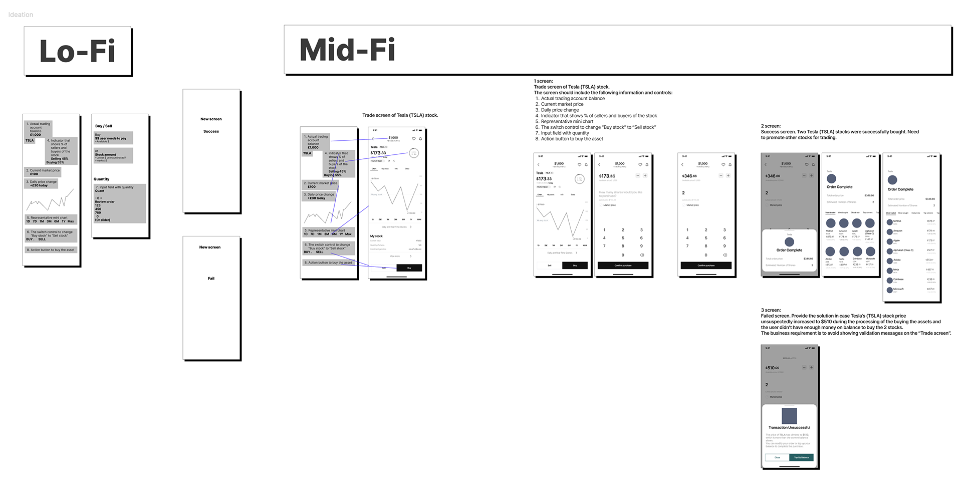
Transitioning to ideation, I focused on the unique selling points of the app. I explored different user flows and interaction patterns to enhance usability. Sketching and wireframing became tools to visualize the potential solutions.
Final Design


Section 1: Trade Screen
The Trade Screen is designed to streamline the stock purchasing process. Users are presented with a clear view of their available funds and the latest market price for the chosen stock, Tesla (TSLA) in this case. The interface includes an interactive chart, showing daily price changes and the market sentiment indicator, enabling users to make informed decisions. With a switch control to toggle between buying and selling modes and an input field for quantity, the transaction process is intuitive. The confirm button is strategically placed for ease of completion, ensuring a smooth and efficient user experience.
The Trade Screen is designed to streamline the stock purchasing process. Users are presented with a clear view of their available funds and the latest market price for the chosen stock, Tesla (TSLA) in this case. The interface includes an interactive chart, showing daily price changes and the market sentiment indicator, enabling users to make informed decisions. With a switch control to toggle between buying and selling modes and an input field for quantity, the transaction process is intuitive. The confirm button is strategically placed for ease of completion, ensuring a smooth and efficient user experience.


Section 2: Order Success Screen
Upon a successful transaction, the user is directed to the Order Success Screen, which confirms the purchase details, including the total order price and the number of shares acquired. This positive reinforcement is coupled with a suggestion to continue trading, subtly encouraging further user engagement with the app. The inclusion of the most traded stocks in the footer acts as a discovery element, inviting further exploration within the app.
Upon a successful transaction, the user is directed to the Order Success Screen, which confirms the purchase details, including the total order price and the number of shares acquired. This positive reinforcement is coupled with a suggestion to continue trading, subtly encouraging further user engagement with the app. The inclusion of the most traded stocks in the footer acts as a discovery element, inviting further exploration within the app.
Section 3: Transaction Unsuccessful Screen
In the event of an unsuccessful transaction, such as an insufficient balance due to a sudden stock price increase, the user is guided to the Transaction Unsuccessful Screen. It clearly communicates the reason for the failure without resorting to jarring validation messages. Instead, it provides constructive options to either modify the order or top up the balance, helping the user to resolve the issue without leaving the trade environment.
In the event of an unsuccessful transaction, such as an insufficient balance due to a sudden stock price increase, the user is guided to the Transaction Unsuccessful Screen. It clearly communicates the reason for the failure without resorting to jarring validation messages. Instead, it provides constructive options to either modify the order or top up the balance, helping the user to resolve the issue without leaving the trade environment.

Design System & UI Assets
For this project, I crafted a mini-design system that became the backbone of the app's user interface.
This system is a curated collection of reusable components and patterns, including buttons, chevrons, headers, and drawer navigations. Each element was meticulously designed with scalability in mind, ensuring consistency throughout the app while providing flexibility for various design scenarios.

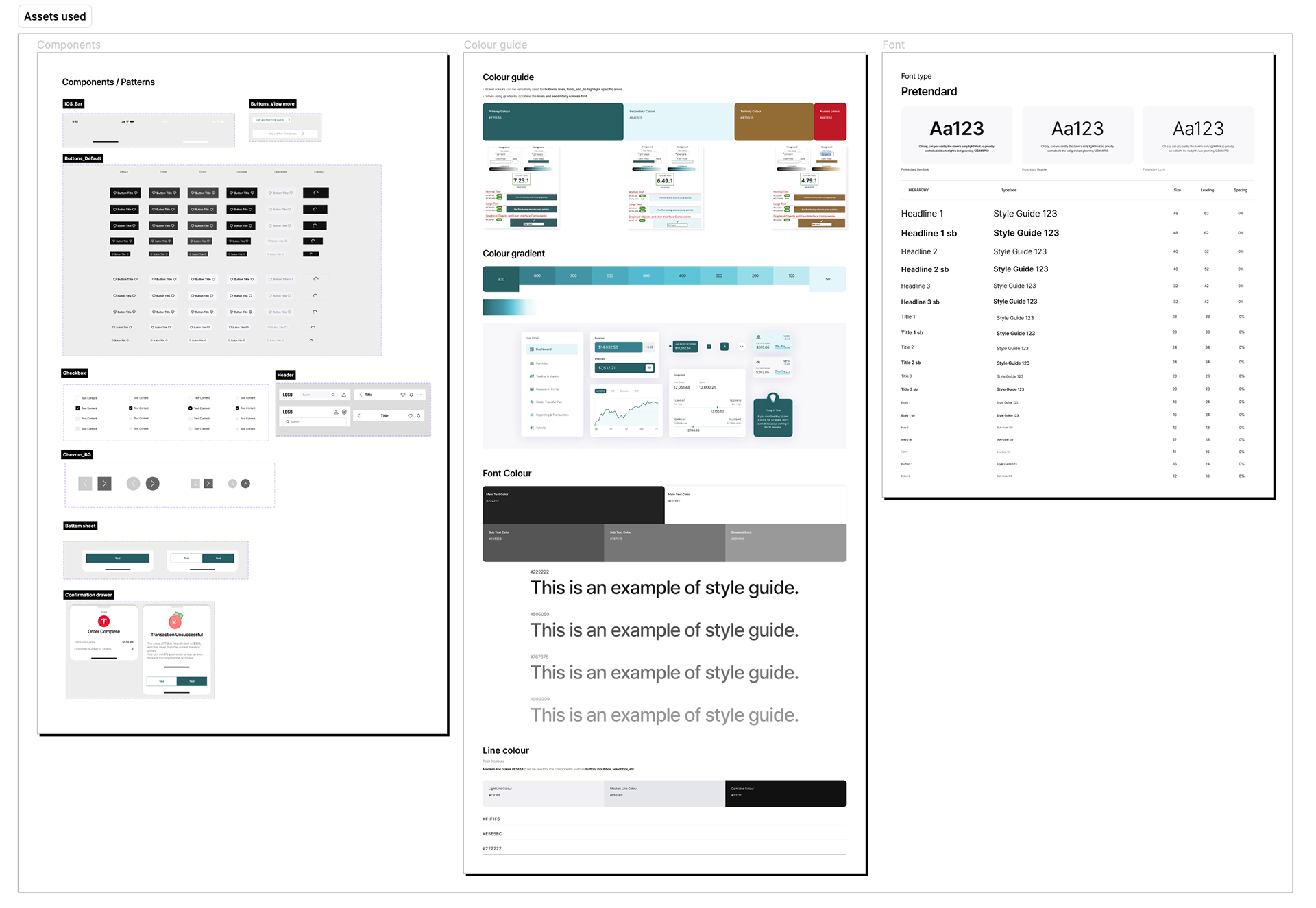
Key Components:
Buttons: Designed for clarity and action, the buttons come in multiple states to guide users naturally through their investment journey.
Buttons: Designed for clarity and action, the buttons come in multiple states to guide users naturally through their investment journey.
Drawers & Headers: Strategically placed to offer navigational ease and quick access to important features without overwhelming the main workspace.
Chevrons: Used within the UI to indicate navigation and expandable menus, aiding in the creation of a fluid user experience.
Style Guide:
The style guide is a visual language dictionary for the app, containing colour palettes, gradients, and font styles. The chosen colour scheme is intended to evoke a sense of trust and stability, crucial for a finance-focused application, while gradients add depth and modernity to the interface. The typography, set in Pretendard, balances readability with a professional aesthetic, critical for presenting financial data.
The style guide is a visual language dictionary for the app, containing colour palettes, gradients, and font styles. The chosen colour scheme is intended to evoke a sense of trust and stability, crucial for a finance-focused application, while gradients add depth and modernity to the interface. The typography, set in Pretendard, balances readability with a professional aesthetic, critical for presenting financial data.
By deploying these UI assets, I was able to maintain a consistent look and feel across the app, reduce development time, and enable the product team to iterate rapidly on future enhancements.
Project Reflection
As I reflect on the project's conclusion, I am proud of what was accomplished within the constrained timeline. The development of a cohesive design system and UI assets that deliver a seamless experience is a career highlight for me. It underscores my commitment to creating functional yet visually appealing digital solutions.
Yet, I acknowledge that design is an ever-evolving discipline that thrives on continuous refinement. Given more time, I would have delved deeper into the end-to-end user journey, conducting extensive research to further tailor the app to user behaviours and market trends. I believe that there is always room for growth, and iterative research could uncover additional opportunities to enhance the user experience.
This project has reaffirmed my dedication to meticulous and user-focused design, and it has inspired me to maintain a mindset of growth and learning. As I move forward, I carry with me the lessons learned and an eagerness to explore new depths in future projects, always aiming to surpass the benchmarks I set today.